Why Flexible Website Design Solutions Matter for Your Business Growth
@ojit45rqft
Getting the Foundation Right
Every business that sells online or attracts customers through a website faces the same basic question: how do we build something that works well and keeps working as we grow? The answer often comes down to the approach a team takes when planning, building, and maintaining their online presence. Too many people start with a template, assume it will handle everything, and then spend months patching holes. That is where thoughtful website design solutions make a real difference. They are not just about making a site look nice. They are about creating a structure that supports your actual business goals, from lead generation to customer support.
What Makes a Good Approach
A solid web project starts with understanding your audience and your own operational limits. If you sell physical products, your needs differ from someone running a consulting practice. A content management system like WordPress gives you flexibility, but it also requires ongoing maintenance. Platforms like Wix or Shopify are easier to start with but can become restrictive when you need custom checkout flows or advanced analytics. The best website design solutions take these trade-offs seriously and match the tool to the task rather than forcing every client into the same box.
For example, a local bakery that updates its menu weekly might do fine on Wix with a simple gallery and a contact form. A retailer selling across multiple regions needs a robust CMS, a reliable hosting provider, and SSL certificate integration to protect transactions. A professional services firm looking to generate leads needs a landing page that loads fast, has a clear call to action, and integrates with Google Analytics so they can measure what actually works. One size does not fit, and pretending it does usually leads to expensive redesigns later.
User Experience Is the Real Metric
You can have a beautiful homepage and still lose visitors because the navigation is confusing or the checkout takes too long. User experience covers everything from how quickly a page loads to whether buttons are easy to tap on a phone. Mobile-first design is no longer optional. More than half of web traffic comes from phones and tablets, and Google now uses mobile version of content for indexing and ranking. If your site is hard to use on a small screen, you are invisible to a large part of your potential audience.

Responsive design is the technical term for making layouts adapt to different screen sizes, but the real goal is consistency. A visitor who finds your site on their phone and later returns on a laptop should feel like they are on the same brand, not a stripped-down version. Tools like Figma and Adobe XD help designers prototype responsive layouts before a single line of code is written. That saves time and catches problems early. But prototyping only works if you actually test with real users, not just with colleagues who already know the interface.
Performance and Speed Go Hand in Hand
Page speed affects everything: user satisfaction, conversion rate optimisation, and search rankings. Google has confirmed that page speed is a ranking factor for both desktop and mobile searches. A site that takes three seconds to load loses about half its visitors before they even see the content. That is the reality for most businesses that skip performance testing until after launch.
Improving speed often involves choosing the right hosting provider, compressing images, and minimising the amount of JavaScript that loads on each page. A good set of website design solutions will include performance benchmarks as part of the build process, not as an afterthought. For instance, an agency might run Google PageSpeed Insights tests during development and fix issues before the site goes live. That kind of discipline pays off immediately in lower bounce rates and higher engagement.
Measuring What Matters
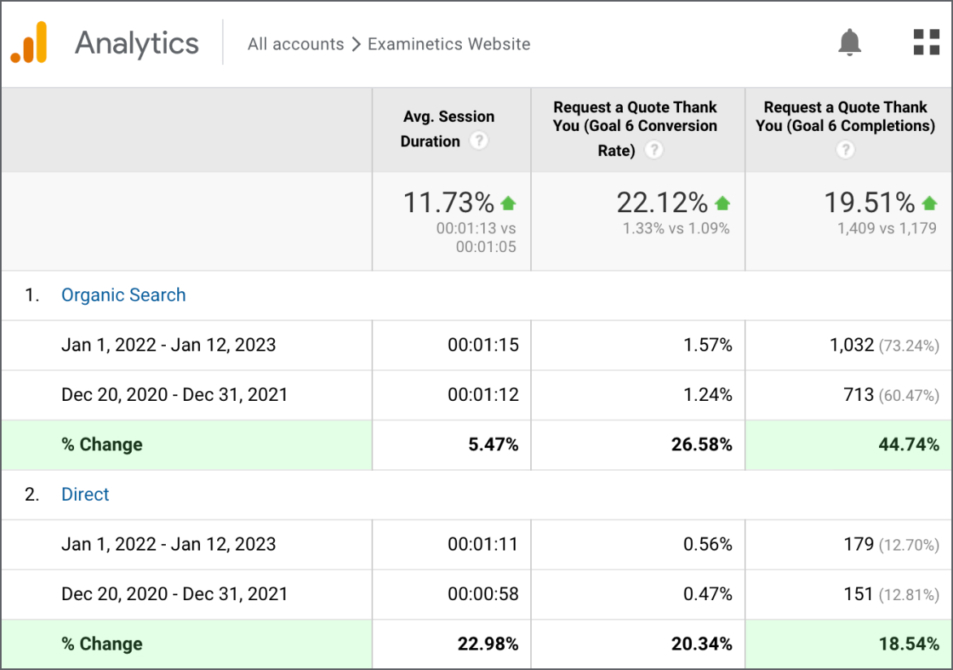
Once your site is live, the work does not stop. You need to know what is working and what is not. Google Analytics gives you the raw data: traffic sources, popular pages, time on site, and conversion paths. But raw data only tells part of the story. Heatmap tools show you where people actually click and how far they scroll. A/B testing lets you compare two versions of a page to see which one drives more signups or purchases. These are not nice-to-haves. They are essential for turning guesses into decisions.
Conversion rate optimisation is the practice of using this data to improve the percentage of visitors who take a desired action, whether that is filling out a form, buying a product, or subscribing to a newsletter. Small changes, like moving the call to action button above the fold or simplifying a form field, can lift conversion rates by double digits. But you need to test those changes against real traffic to be sure they are actually improvements. That is where the combination of analytics tools and a flexible CMS becomes powerful. You can iterate without breaking the whole site.
Content Management and Long-Term Maintenance
A website is not a one-time project. It needs updates, security patches, and fresh content to stay relevant. The content management system you choose determines how easy or painful that ongoing work will be. WordPress gives you thousands of plugins and themes, but it also means you need to manage updates carefully to avoid conflicts. Shopify handles hosting and security for you, but you pay a monthly fee and may face limits on custom functionality.
If you are running an ecommerce store, Shopify is a strong choice because it includes payment processing, inventory management, and shipping tools out of the box. If you need a blog-heavy site with custom post types, WordPress gives you more control. The key is to pick a CMS that matches your team's skill level and your long-term content plans. A site that is hard to update will quickly fall out of date, and an outdated site erodes trust with visitors.
Security and Trust Signals
An SSL certificate is now standard for any site that collects personal information or processes payments. Browsers mark sites without HTTPS as not secure, which scares visitors away. But security goes beyond the certificate itself. Your hosting provider should offer automated backups, firewall protection, and regular software updates. If you are using third-party tools like Google Analytics or heatmap scripts, make sure they are loaded securely and do not slow down the page.
Trust also comes from design choices. A clear privacy policy, visible contact information, and a professional layout all signal that you are a legitimate business. These elements are part of the overall user experience and should be considered early in the design phase, not tacked on at the end. When a visitor lands on your site and sees a consistent brand, fast load times, and easy navigation, they are far more likely to stay and explore.
Practical Steps for Choosing the Right Path
If you are evaluating website design solutions for your own business, start by writing down your top three goals for the next year. Then list the constraints you face: budget, technical skills available in-house, and timeline. Use those two lists to filter your options. For example:
- If speed to market matters most, a platform like Wix or Squarespace can get you online in days.
- If you need deep customisation and own the technical resources, WordPress with a custom theme is a strong path.
- If you sell products and want an all-in-one ecommerce system, Shopify handles most of the heavy lifting.
- If you need a simple landing page to test a new product idea, a single-page build with a clear call to action and Google Analytics tracking is enough.
- If you have an existing site that is underperforming, consider a redesign focused on conversion rate optimisation and page speed improvements before starting from scratch.
Bringing It All Together
Good website design solutions are not about following trends or copying a competitor. They are about building a digital presence that works for your specific situation. That means choosing the right CMS, investing in responsive design, prioritising page speed, and committing to ongoing measurement through tools like Google Analytics and heatmaps. It also means being honest about what you can manage yourself and when you need help from a professional team.
A well-planned site pays for itself over time through better conversion rates, lower support costs, and higher search rankings. A poorly planned site does the opposite: it bleeds money through lost sales and constant fixes. The difference comes down to the quality of the thinking that goes into the initial build. Whether you handle it in-house or work with an agency, make sure the process includes real user testing, performance benchmarks, and a clear content strategy. That is how you turn a website from a static brochure into a growth engine for your business.